The Ultimate Evolution Guide to the Murder Mystery 2 Logo History
Discover the evolution of the iconic Murder Mystery 2 logo. Learn about design changes, community significance, and how to spot authentic branding in Roblox.
Published:
Table of Contents
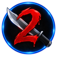
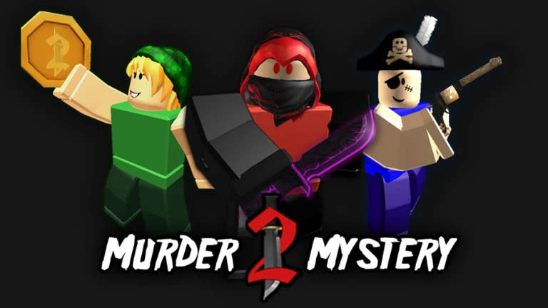
For millions of Roblox players, the Murder Mystery 2 logo represents more than just a game icon—it is a symbol of thousands of hours spent chasing down innocents or surviving as the sheriff. Understanding the history and evolution of this visual identity provides a unique window into the growth of one of the platform’s most legendary titles.
The Murder Mystery 2 logo has undergone several significant transformations since the game’s inception, reflecting the title's shift from a niche passion project to a dominant force in the Roblox ecosystem. By tracing these design shifts, we can appreciate the professional evolution that Nikilis, the developer, has steered over the years.
The Chronology of Brand Identity
The visual representation of a game often dictates how players perceive its atmosphere. In the case of MM2, the branding has moved from minimalist, early-Roblox aesthetics to more polished, high-fidelity designs that align with modern gaming standards.
Era
Notable Design Characteristics
Primary Platform Focus
2014-2015
Retro, blocky text, simple font
Early Roblox PC
2018-2024
Sleek, modern, balanced weight
PC and Mobile Cross-play
2025-Present
Refined clarity, high contrast
High-Definition UI
According to community archives, the shift toward a more modern Murder Mystery 2 logo design coincided with the massive surge in the game's popularity as it expanded to include a global audience, including specialized regional branding in China.
Why Branding Matters in Roblox Games
Why should a player care about a logo? Beyond aesthetics, a clear and recognizable Murder Mystery 2 logo helps players identify official content versus community-made clones or scams. In an environment where trading knives and pets is central to the economy, visual authenticity is vital.
Spotting Official Content
Always verify the game's developer is Nikilis by checking the official Murder Mystery 2 Roblox page. Never trust external links or "logo generators" that ask for your account credentials.
The Power of Visual Recognition
When you are deep in a round of "Sheriff vs. Murderer," you might not be thinking about graphic design. However, the consistent use of a distinct logo establishes trust. It tells the player that they are in a high-quality, maintained experience rather than a "copy-paste" hobby game.
Design Transitions: A Detailed Breakdown
The Murder Mystery 2 logo has evolved significantly over the last decade. Early versions focused on a "gritty" mystery theme, which eventually gave way to the vibrant, clean aesthetic we see today.
Key Design Changes
Font Weight: Moving from thin, erratic lettering to bold, weighted typography.
Color Palette: Shifting from muted tones to high-contrast colors that pop on smaller mobile screens.
Iconography: Integrating elements of the game's signature weaponry (knives and guns) into the lettering itself.
Many players note that the return of classic design elements in recent updates, often discussed in community reports, serves as a nostalgic "thank you" to veterans who have been playing since the 2014 era.
Engaging with the MM2 Community
Beyond the static images, the Murder Mystery 2 logo is frequently used in community-created content, from YouTube compilations to fan art. This creative output is a testament to the game's longevity.
How Players Use the Branding
Thumbnail Art: Creators use the official logo to denote high-stakes gameplay videos.
Trading Hubs: Players often incorporate the logo into custom templates to signal that their trades are "official" or legitimate.
Social Media Profiles: Fans display the logo to show allegiance to their favorite game mode.
Usage Type
Best Practice
Risk
Fan Videos
Use transparent PNGs
Copyright flags if monetized poorly
Social Media
Keep proportions correct
Appearing unprofessional
Trading Server
Overlay on item screenshots
Could look like a scam attempt
Practical Tips for Your Own Content
If you are a content creator looking to use the Murder Mystery 2 logo in your thumbnails, keep it clean. Avoid distorting the aspect ratio, as this immediately flags your content as low-quality to viewers.
Avoiding Common Mistakes
Don't stretch the logo: This is the most common mistake. Always use the Shift key when resizing.
Avoid outdated versions: Using a 2014 logo in a 2026 video creates a confusing visual identity for your audience. Stick to the current branding to stay relevant.
Respect the IP: Remember that the branding is the intellectual property of Nikilis; using it for commercial gain outside of transformative content (like reviews or gameplay) can be problematic.
Frequently Asked Questions
Where can I find the official Murder Mystery 2 logo?
You should only use assets found via the official Roblox platform or verified community wikis. Always ensure the source is reliable, such as the Fandom Logopedia, to avoid downloading malware.
Does the game have different logos for different regions?
Yes, as noted by community archives, there are specific variants of the Murder Mystery 2 logo used in regions like China to comply with local branding requirements and localization standards.
Is it safe to download logo packs from third-party sites?
[!WARNING]
Security Risk
Be extremely cautious. Many sites promising "high-res icon packs" for Roblox games host malicious files. Always scan downloads with reputable antivirus software and prefer official sources.
Why does the logo look different sometimes?
The game's branding is often updated to celebrate seasonal events, such as Hallow's Eve or special anniversary milestones, reflecting the dynamic nature of the game's live-service model.